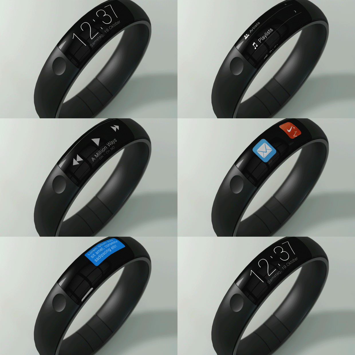
Apple iWatch Concept

Thomas Bogner, a student at Germany’s Technische Hochschule Deggendorf, has designed a concept himself inspired by his desire to have an improved Nike+ Fuelband with more features. ”This concept was clearly inspired due [to] the experience with the Nike+ Fuelbands — I just fell in love with its flawless form factor,” Bogner told Mashable. ”What I was missing in all those iWatch mockups to date, they never felt ‘Apple-like’ and ‘unisex.’ If my girlfriend wouldn’t wear, but I would — it’s basically not Apple. For me, personally, the iPod click wheel was one of the most stunning implementations of UI in a consumer device; that’s probably the reason why [I] wanted the Interface to ‘rotate’ around a wrist.”
With this in mind, his animated GIF concept captures the functionality of a scrolling screen into the minimal form of a Nike + Fuelband, showing the narrow four-icon wide display scrolling through various familiar iOS features including music and chat. What makes Bogner’s design so unique is that further condenses the device’s form factor, doing away with the thick strap-on-square-tile design adopted by most smart watches and making it appear more like a bracelet, something that would undoubtedly be more attractive to someone who doesn’t exactly want to look like they’re wearing a next-gen calculator watch.
